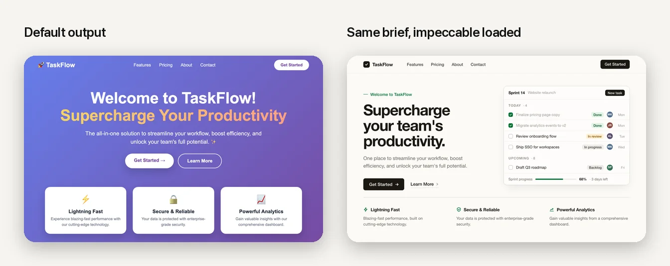
People are getting good at spotting what was built by AI. Same gradient, same three-card row, same hero with the rounded button. It is not that the sites are ugly. It is that they look like nobody made them, and nobody buys from a site that looks like nobody made it. If your app looks vibe coded, every sale gets harder.
This is the written version of the guide we promised in the video, and it goes further than the video could: what "looks vibe coded" actually consists of, how each of the two tools works, and then the part people really asked for, how to prompt for design so that the output is yours and not the average of the internet.
Why it looks vibe coded
Every model trained on the same SaaS templates. Ask for "a modern, clean landing page" with no further direction and you get the statistical centre of everything it has seen: the same purple-to-blue gradient, one font at one weight, cards nested in cards, an icon tile above every heading. It is not a bug. It is what "average" looks like, and average is exactly what a prompt with no point of view asks for.
The good news is that the tells are specific and finite. Once you can name them, you can forbid them, and the model will comply. The team behind impeccable maintains a public catalogue of sixty-four of them, with a detector that flags them in your code (impeccable.style/slop). These are the ones that show up in almost every vibe-coded site we audit:
- Purple-to-blue gradients on buttons, text, backgrounds, orbs. The AI colour palette.
- Gradient text in the headline.
- Emoji as icons, and identical rounded icon tiles above every heading.
- Three identical cards in a row, each with a big soft drop shadow.
- Cards inside cards inside cards, each with its own padding and shadow.
- The side-tab card: a thick coloured border on one edge of a rounded card. The single most recognisable tell.
- One font for everything (usually Inter), one weight, no hierarchy.
- The centred hero: headline, subline, two pill buttons side by side, all centred.
- Grey text on coloured backgrounds, and low-contrast labels.
- "Introducing" eyebrow chips, pulsing status dots, and italic serif flourishes on an off-white "AI beige".
- Redundant copy: label, sublabel, helper text, and hint all saying the same thing.
- Motion without meaning: bouncing buttons, wiggling icons, floating badges.
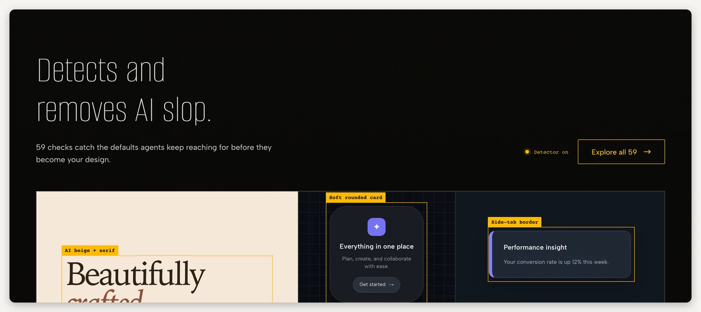
Two things and your site stops looking like that. Neither needs you to write code or learn design. Together they take an afternoon.
Way one: impeccable, a design skill for your coding agent
impeccable is a skill file: a folder of instructions your agent loads when a task is about design. It gives Claude (or Cursor, Codex, Gemini CLI) a real design vocabulary and a real point of view, so it designs from principles instead of averaging. Three things about it matter for you.
It makes you think about your users first. The command /impeccable teach interviews you: who the product is for, where and when they use it, what it should feel like, what it must never look like. It writes the answers into two files, PRODUCT.md and DESIGN.md, and every design decision after that is checked against them. Run it once per project. This is the part that makes the output yours; without a brief, any tool produces a house style.
It gives you commands instead of adjectives. Twenty-three of them, each naming one kind of intervention: /impeccable polish for the final quality pass, /impeccable typeset for type hierarchy, /impeccable layout for spacing and rhythm, /impeccable distill to strip complexity, /impeccable critique for a scored design review, /impeccable audit for accessibility, responsiveness, and production quality, /impeccable bolder and /impeccable quieter to turn the volume. "Make it look better" is a wish. /impeccable typeset hero is an instruction.
It removes the tells for you. The detector runs on your source (npx impeccable detect) and in the browser, and /impeccable polish runs it before handing work back, so the side-tab borders and the beige and the pulsing dots go away without you hunting for them.
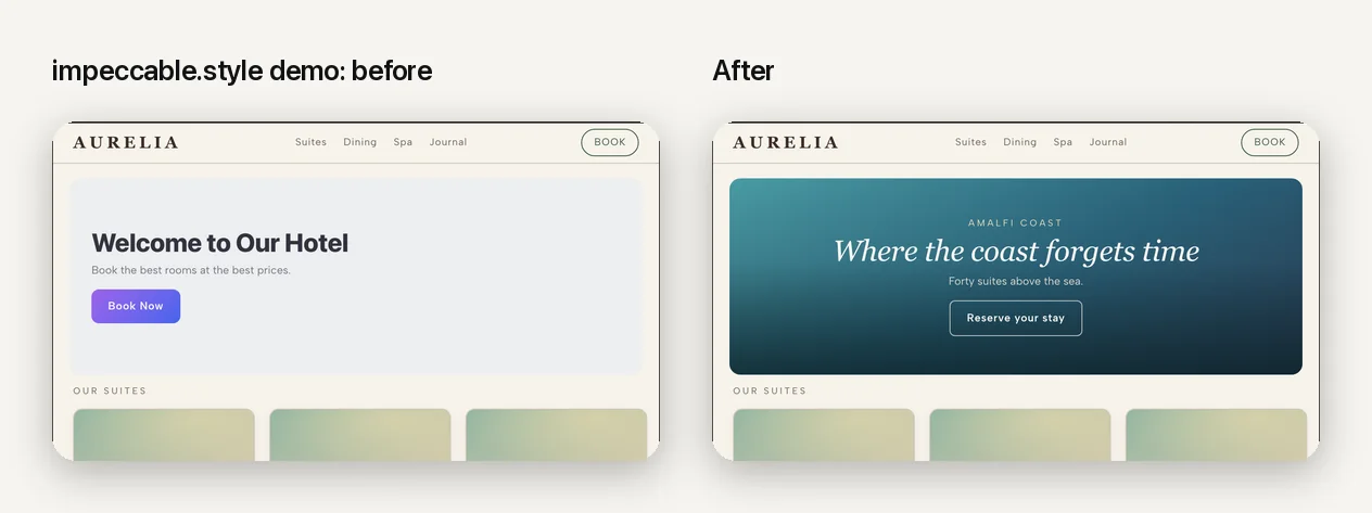
Install: from your project root, npx impeccable install, then /impeccable init inside your coding tool, then /impeccable teach. Or download the repo and drop .claude/skills/impeccable/ into your project. Full detail, including how skills work in general, is in our skills guide.
Way two: 21st.dev, real components that ship as prompts
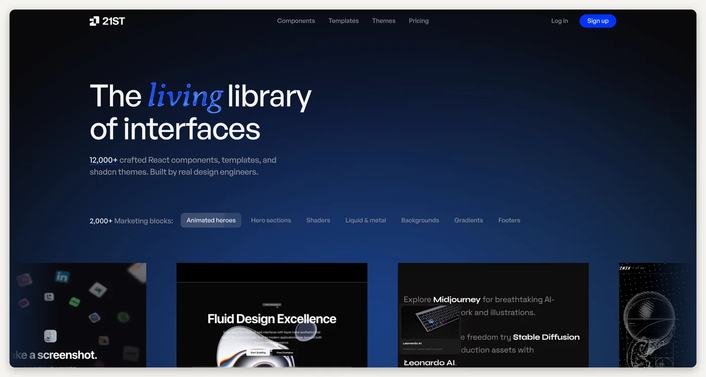
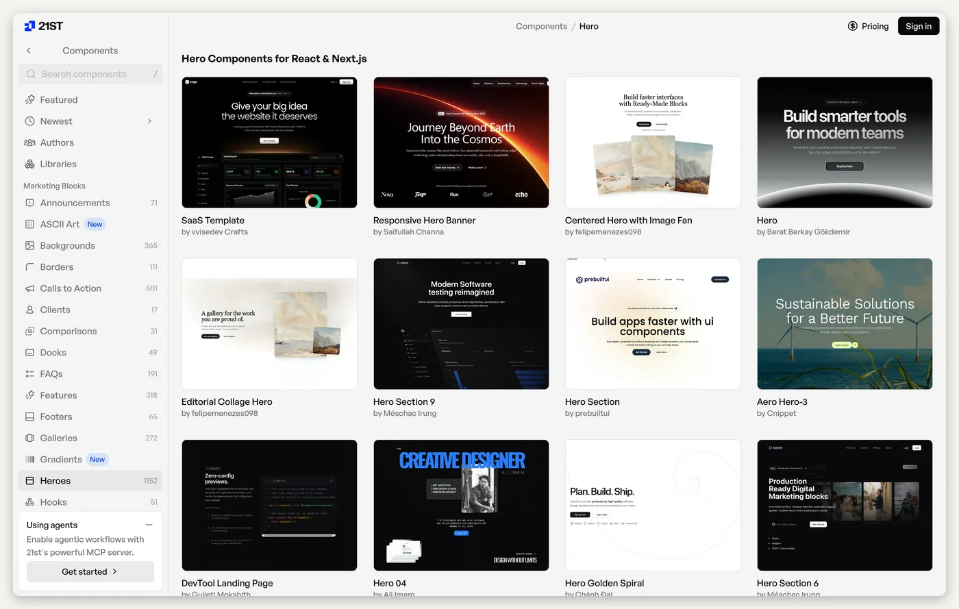
The second problem with an AI-built site is that the model is inventing a nav bar, a hero, and a pricing table from memory every time. 21st.dev is a library of those parts, made by people who do this for a living (Aceternity UI, Magic UI, shadcn/ui, Origin UI, Geist, and hundreds of individual design engineers), indexed and searchable: heroes, navigation, pricing, footers, sign-in screens, backgrounds, buttons, AI chat interfaces, whole templates. Every one is real React and Tailwind source that lands in your repo, following shadcn conventions, yours to edit.
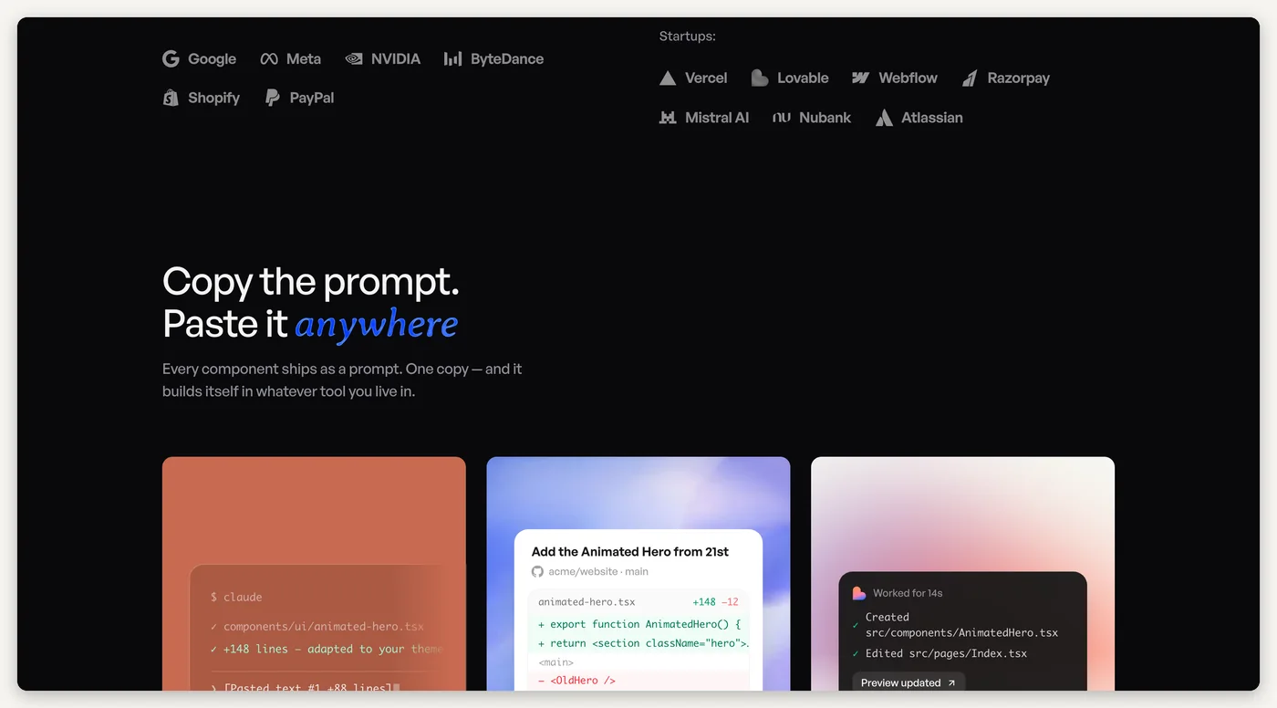
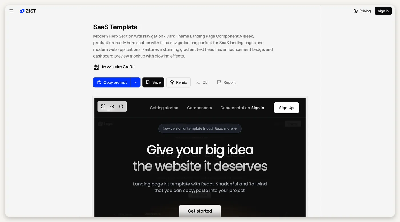
The part that matters for you: every component ships as a prompt. You pick one, hit "Copy prompt", and paste it into Claude Code, Codex, Cursor, or straight into Lovable's chat. The agent adapts it to your project's theme and wires it in. Instead of inventing a hero, it builds against something a designer already made.
How to use it well (this is where people go wrong):
- Pick one, not five. Choose one hero or one pricing section that matches the direction in your
DESIGN.md. Mixing four libraries' aesthetics on one page is its own kind of vibe coded. - Use it as a reference, not wallpaper. After you paste the prompt, add one sentence: "adapt this to our palette and type; keep the layout and spacing, drop the gradient." The layout is the value. The colours are the component author's, not yours.
- Expect a few iterations. The first paste is rarely final. It usually takes two or three passes (below) to make it sit right in your page. That is normal, and it is still an afternoon rather than a week.
- Save what works. Bookmark the components you end up using; the next screen should feel like the same product.
How to prompt Claude for design
The tools give the model taste and parts. The prompt is still what decides whether you get your site or the average one. Here is the shape of a prompt that works, and why each part is there.
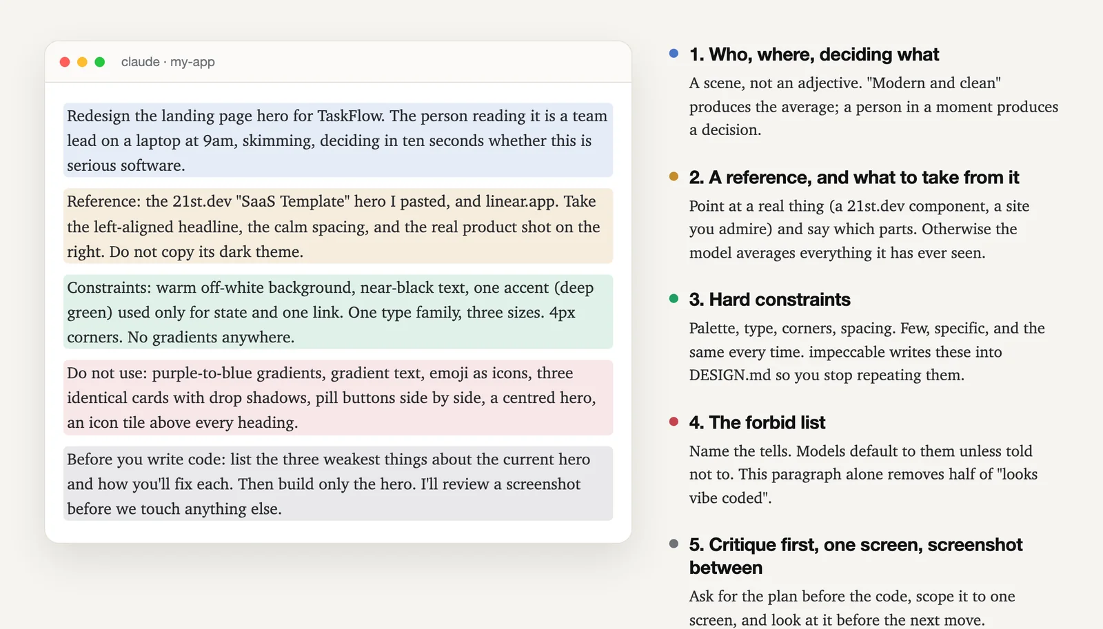
- Who, where, deciding what. Not "modern and clean." A person in a moment: "a team lead on a laptop at 9am, skimming, deciding in ten seconds whether this is serious software." Adjectives produce the average. A scene forces decisions about size, contrast, and what goes first.
- A reference, and what to take from it. Paste the 21st.dev prompt, or name a site you admire, and say which parts: "the left-aligned headline, the calm spacing, the real product shot on the right. Do not copy its dark theme." Without a reference the model averages everything it has ever seen. With a reference and no instruction it copies the wrong things.
- Hard constraints. Palette (one accent, and what it is for), type (one family, three sizes), corners, spacing. Few and specific, and the same every time. This is exactly what impeccable writes into
DESIGN.md, so after/impeccable teachyou stop having to repeat them. - The forbid list. Name the tells from the list above. Models default to them unless told not to. This one paragraph removes about half of "looks vibe coded" on its own.
- Critique first, one screen, screenshot between. "Before you write code, list the three weakest things about the current hero and how you'll fix each. Then build only the hero." Asking for the plan first surfaces bad decisions while they are still cheap. Scoping to one screen keeps the change reviewable. Then look at it before the next move.
Here is the whole thing as a template you can paste. Replace the brackets; keep the shape.
Redesign [the screen] for [product]. The person looking at it is [who], on [device], [when], trying to [decide or do what] in [how long].

Reference: [paste the 21st.dev prompt, or name a site]. Take [the specific parts]. Do not take [the parts that aren't ours].

Constraints: [background], [text colour], one accent ([colour]) used only for [purpose]. One type family, three sizes. [Corner radius]. No gradients anywhere.

Do not use: purple-to-blue gradients, gradient text, emoji as icons, three identical cards with drop shadows, pill buttons side by side, a centred hero, an icon tile above every heading, side-tab card borders, cards inside cards.

Before you write code, list the three weakest things about the current [screen] and how you'll fix each. Then build only [the screen]. I'll review a screenshot before we touch anything else.
The prompt that gets the average
"Make the landing page look more modern, clean and professional, like a real startup. Use nice colours and make it pop."
The prompt that gets yours
"/impeccable polish the pricing page. Keep our sharp corners and sober palette. Remove the AI tells." (impeccable's own example, and it is a better prompt than most people ever write.)
The loop: prompt, screenshot, name the tell, change one thing
Nobody's first output is final, including ours. What separates a site that looks designed from one that looks generated is not a better first prompt; it is two or three honest passes afterwards. This is the loop.
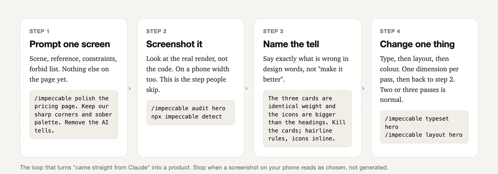
- Prompt one screen. The five-part prompt above, scoped to a single screen or section. Not "the whole site".
- Screenshot it. Look at the real render, not the code, and look at it at phone width, because that is where most of your visitors are. This is the step people skip, and it is why they ship things they would never have approved if they had looked.
/impeccable auditandnpx impeccable detectdo a mechanical version of this for you. - Name the tell. Say exactly what is wrong, in design words: "the three cards are identical weight and the icons are bigger than the headings" beats "it still looks a bit AI." If you cannot name it, ask:
/impeccable critique heroreturns a scored list, and you pick the top item. - Change one thing, then go back to step two. Type first (
/impeccable typeset), then layout (/impeccable layout), then colour (/impeccable colorizeorquieter). One dimension per pass. Asking for everything at once is how you get a new set of problems instead of fewer.
Write the decisions down. Every choice you approve (this accent, these corners, this type scale) goes into DESIGN.md. Then the next screen, and the next session, and the next person, inherit it. That file is the difference between "we got the hero right once" and "the product has a look."
Keep the speed. None of this slows the build. The first pass takes the same ten minutes it always did; the two passes after it are what you were going to spend anyway on the third "can you make it pop" prompt, except now they converge.
The mistakes we see most
- Adjective soup. "Modern, clean, sleek, professional, premium." Every one of those words means "average" to a model. Replace them with a person, a reference, and a constraint.
- Everything at once. "Redesign the whole site" produces a whole new set of tells. One screen, one dimension per pass.
- Accepting the first output. The first pass is a draft. Two more passes is where "designed" happens.
- Five component libraries on one page. A 21st.dev hero from one author, a pricing table from another, a footer from a third, each in its own palette. Pick a lane and adapt everything into it.
- Dark mode as a shortcut. Dark themes hide a lot of sins and read as "techy" for about a week. If your users are on laptops in daylight, a light page with real hierarchy will beat it.
- Never looking at the phone. Most of your visitors will. Screenshot at 390 wide before you call anything done.
- New session, no memory. If your decisions live only in chat history, the next session reinvents them.
DESIGN.md, committed to the repo, is the fix.
Questions people ask
Do I need to know design to do this?
No. You need to be able to say who the page is for, point at something you like, and name what looks wrong in plain words. impeccable supplies the design vocabulary and the rules; 21st.dev supplies real components to build against. Your job is taste and judgement, not craft.
Does this work in Lovable, Bolt, or Cursor, or only Claude Code?
All of them. impeccable installs into Claude Code, Cursor, Codex, Gemini CLI, and others. 21st.dev prompts paste into Claude Code, Codex, Cursor, and directly into Lovable's chat. The five-part prompt is tool-agnostic; it is just a better way of asking.
Should I just buy a template instead?
A template gets you to good faster on day one and then fights you on day thirty, when your product needs a screen the template never imagined. Building against a 21st.dev component with your own DESIGN.md gets you to good almost as fast and keeps working as the product grows.
What does this cost?
impeccable is free and open source. 21st.dev is free to browse; copying prompts needs a free account, and there are paid tiers for teams and heavier use. The prompt and the loop cost nothing but attention.
Won't every site using impeccable look the same?
Not if you use it properly. The first thing it does is interview you about your product and users and write that into a DESIGN.md, so every decision after that is grounded in your product, not a house style. It also deliberately generates competing design directions rather than one default. Sites that look the same are the ones nobody gave a brief.